Oakwood School — Brilliance Award Winner!
This California school initially hired us to reorganize their marketing materials while working with existing graphic design components. As we got to know one another, we realized that we “got” each other, and because of the trust we established, we were able to take on a sacred cow — the school’s logo. Though this combination symbol and wordmark was well liked, it caused production issues in both printing and embroidering. Our redesigned logo is a wordmark that maintains the elements everyone loved while being elegant, clean, legible, and produceable. It won a Brilliance Award! We also designed the school’s first athletic mark, based on their hawk mascot, resulting in a unified look for Oakwood’s uniforms and spirit wear.
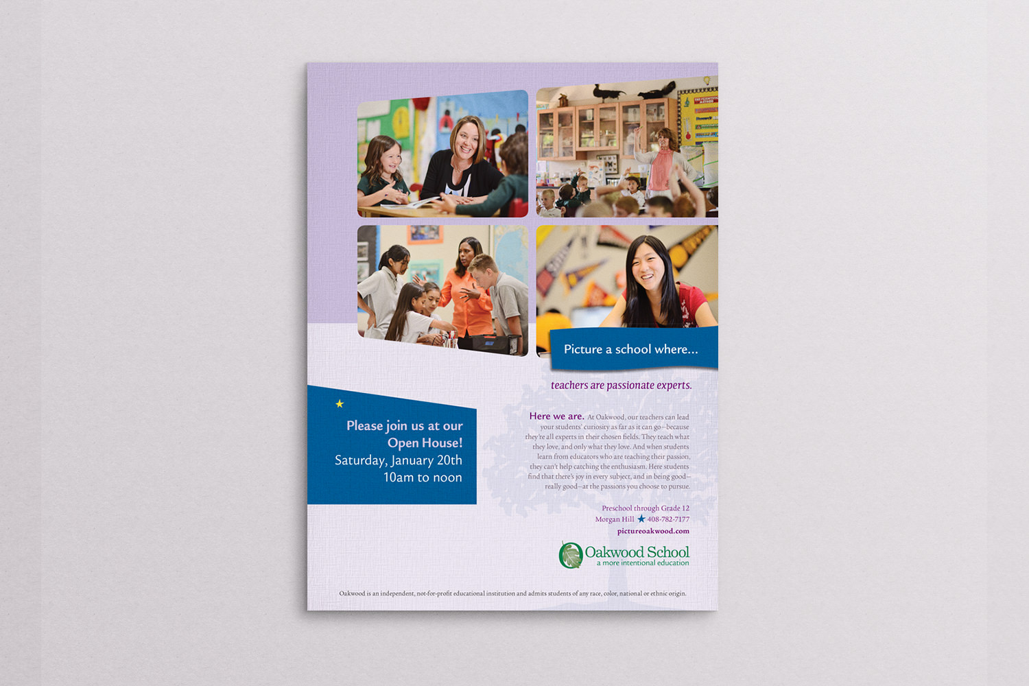
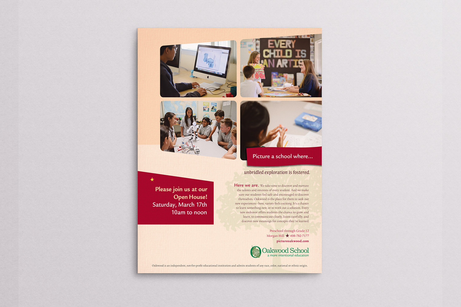
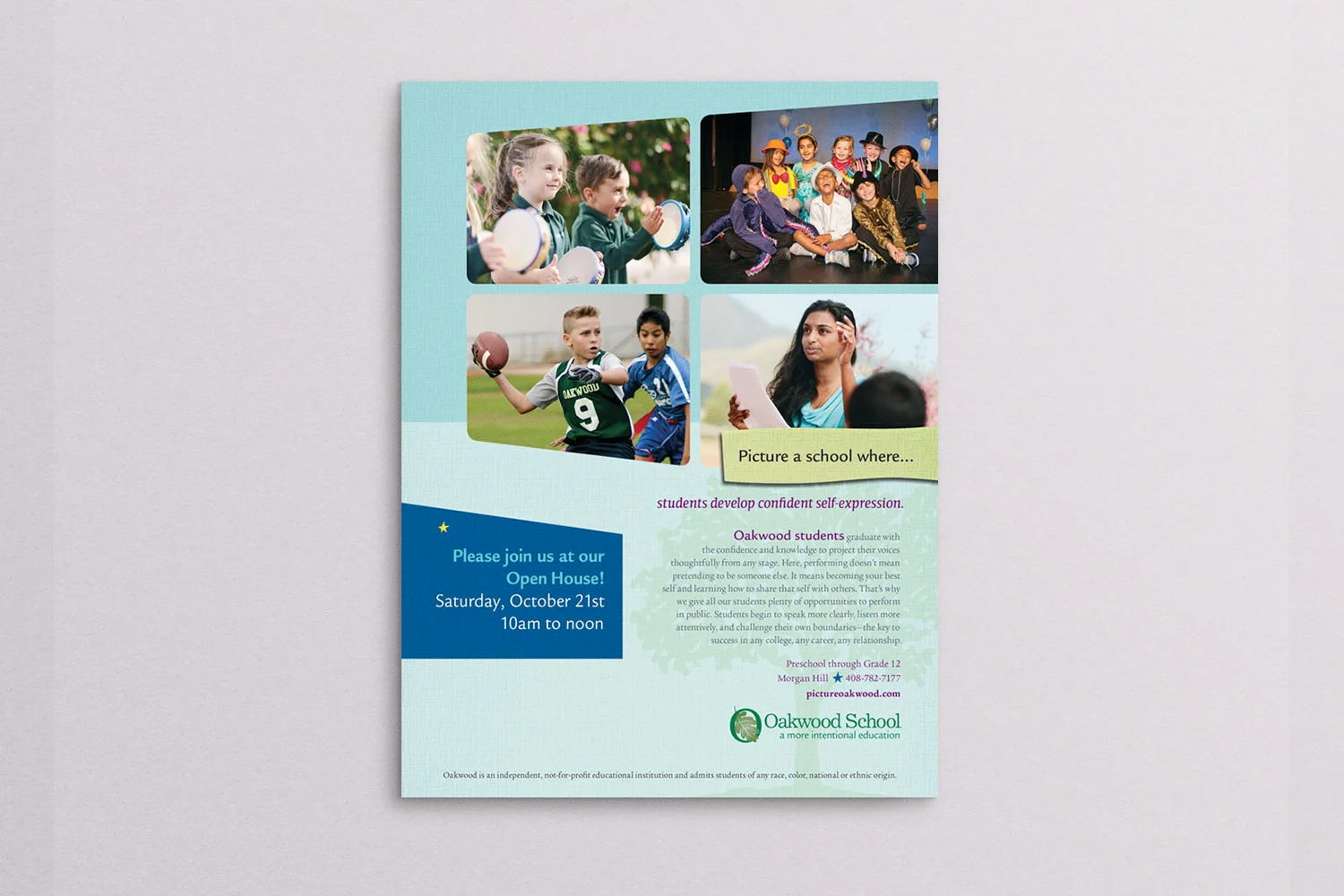
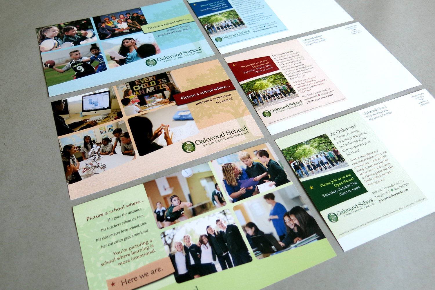
Open House Postcards
Capital Campaign Logo